
I’d like to demo a simple how-to. There are many, many techniques to make pages load faster, but this post attempts to demonstrate large gains from very small code changes.
People often build beautiful sites with multiple easy-to-use JavaScript libraries. Then, when it comes to addressing frontend performance, suddenly those libraries are an enormous download that the users are forced to bear.
Just one image
Before you go worrying about how to minify every last library or shave tests out of Modernizr, try and see if you can remove just one photo from your design. It will make a bigger difference.
Coined by Adam Sontag, the “one less JPG” idea — nay, MOVEMENT — is summed up perfectly here:
The solution to worrying about JS lib/framework size: include one less .jpg on your site. #throneofjs
— Mike Taylor (@miketaylr) July 22, 2012
Real example
Last year we re-launched Pressflow.org. We have some mobile traffic, but it’s likely people just browsing for info, since no one has a good reason to download Pressflow onto a phone or tablet. Let’s keep their attention and make the experience fast.
We have this huge, beautiful mountain on the homepage. It’s great. But it’s also 160K. I tried making it smaller, or splitting the photo off of the background pattern, but it decreased the quality of the photo too much when I lowered the file size. We made a wonderfully small SVG logo, but that’s not an option for a photograph with this kind of detail.
How much impact does it have?
A mountain is a big thing — just like the amount of traffic Pressflow can handle — and the image we chose was meant to convey that vastness. Since it doesn’t really pack the same punch on smaller screens, why include it at all? I decided to use Modernizr and conditionally load the stylesheet that references the mountain. That way it never gets loaded by tiny screens that don’t need it.
Using the Modernizr Drupal module, I added a conditional load into the .info file of my theme:
; Load CSS with Modernizr
modernizr[Modernizr.mq('screen and (min-width: 42em)')][yep][] = css/big.css
This tells Modernizr to output a Modernizr.load() statement with the test I specified. In this case, Modernizr will only load big.css if the test is true. My test checks the width of the window using a media query (Modernizr.mq()) and returns true if the screen is at least 42em, causing the CSS to be fetched. Here’s the JavaScript output:
Modernizr.load({
  test: Modernizr.mq('screen and (min-width: 42em)'),
  yep : 'http://pressflow.org/sites/all/themes/pfo/css/big.css',
});
So that’s it, instant savings!
..oh what’s that? Always test your work? Thanks for keeping me honest.
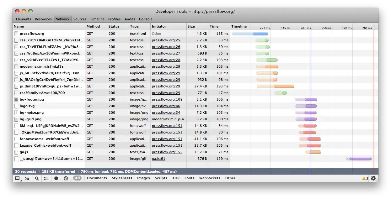
Here’s some data.
I’ve got two network waterfalls here for comparison. They show a pretty stark difference following this one-line change to my code. If a screen isn’t big enough for the mountain, it’ll only take 20 HTTP requests and 193K total. If the screen is big enough, it takes 24 HTTP requests — for the CSS and then the images inside it — totalling 384KB total. That’s a savings of 191KB (almost exactly 50%) from a single change to my code. You’d have to remove 19 copies of jQuery 2.0 to achieve this kind of bandwidth savings.
(by the way, didja hear that jQuery 2.0 has small QSA-only custom builds?)
Small screens
Big screens
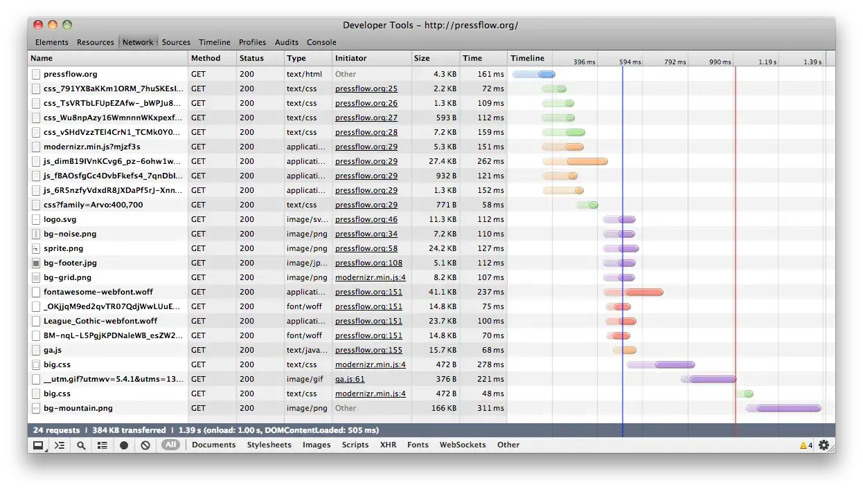
You can see in the second waterfall that the Initiator of big.css is modernizr.min.js, meaning that JavaScript loaded the file after running the test.
ThoughtContentLoaded
I hope this shows how easy it can be to reduce your page weight without worrying about shaving bytes of JavaScript that are supplying valuable functionality if you know how to use them right.
If you want to know more about the conditional loading API within Modernizr, head over to yepnope.js documentation and start reading. For more Drupal-specific examples check out the official documentation for conditional loading using the Modernizr module.
Making the web a better place to teach, learn, and advocate starts here...
When you subscribe to our newsletter!